Frame.io (Adobe)
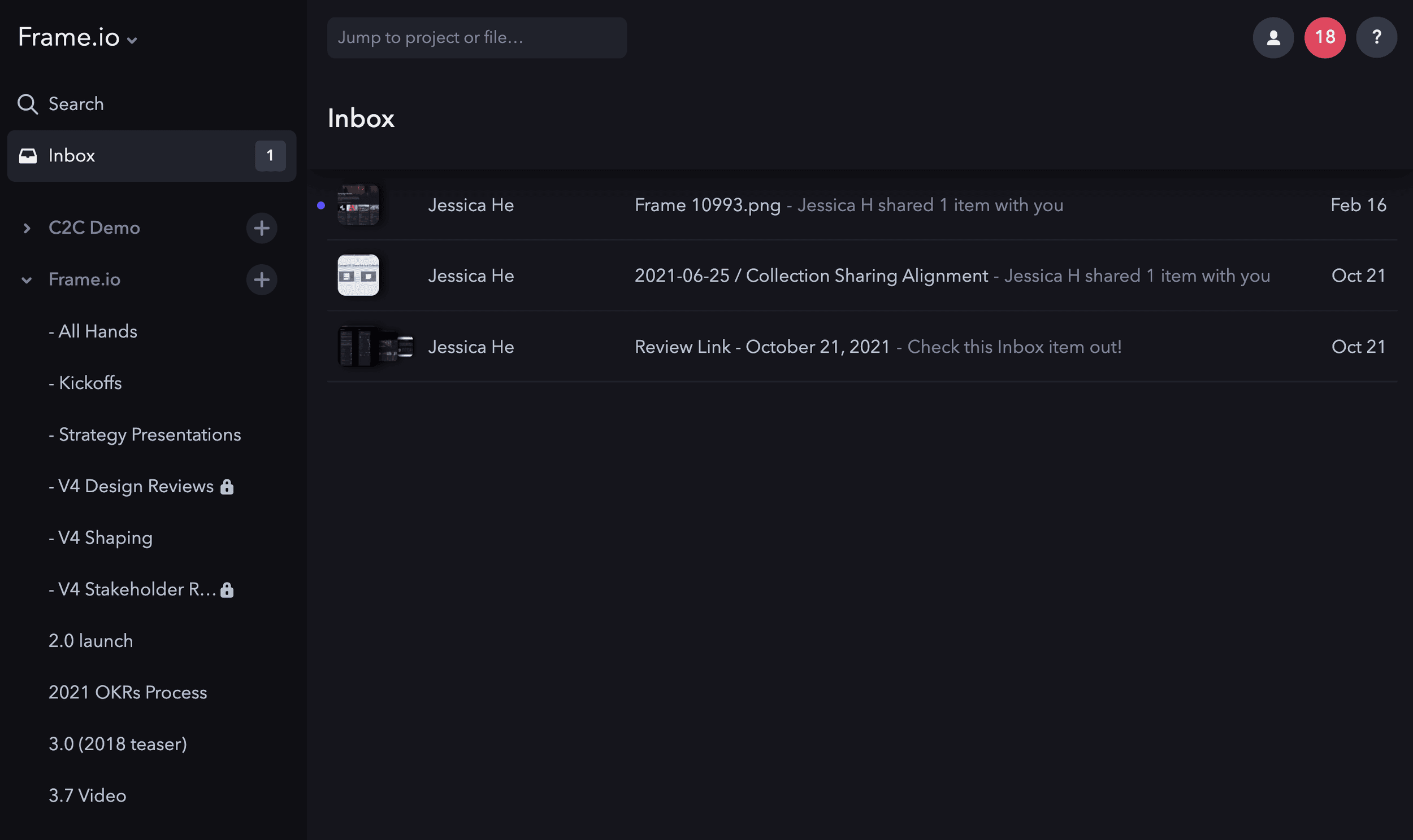
Inbox
A centralized space for video review requests — empowering film industry professionals with smart tools and seamless navigation.
Lead Product Designer
Product Manager, Creative Director, Design team, Workflow Architect, Eng manager
Target users: Reviewers
Reviewers are users who actively review and approve content. Common job titles include: Creative Directors, Producers, Executives, Clients, or Project Stakeholders.
Seamless Access
Reviewers need a seamless way to navigate through all their shared assets so they can review the work exactly how the creators intended.
Track & Manage
Reviewers need to view an aggregate of all their shared assets and manage its organization, feeling a sense of agency and confidence in their progress.
Feedback
Reviewers need an easy way to share their feedback on work and feel confident that the right people will see it at the right time.
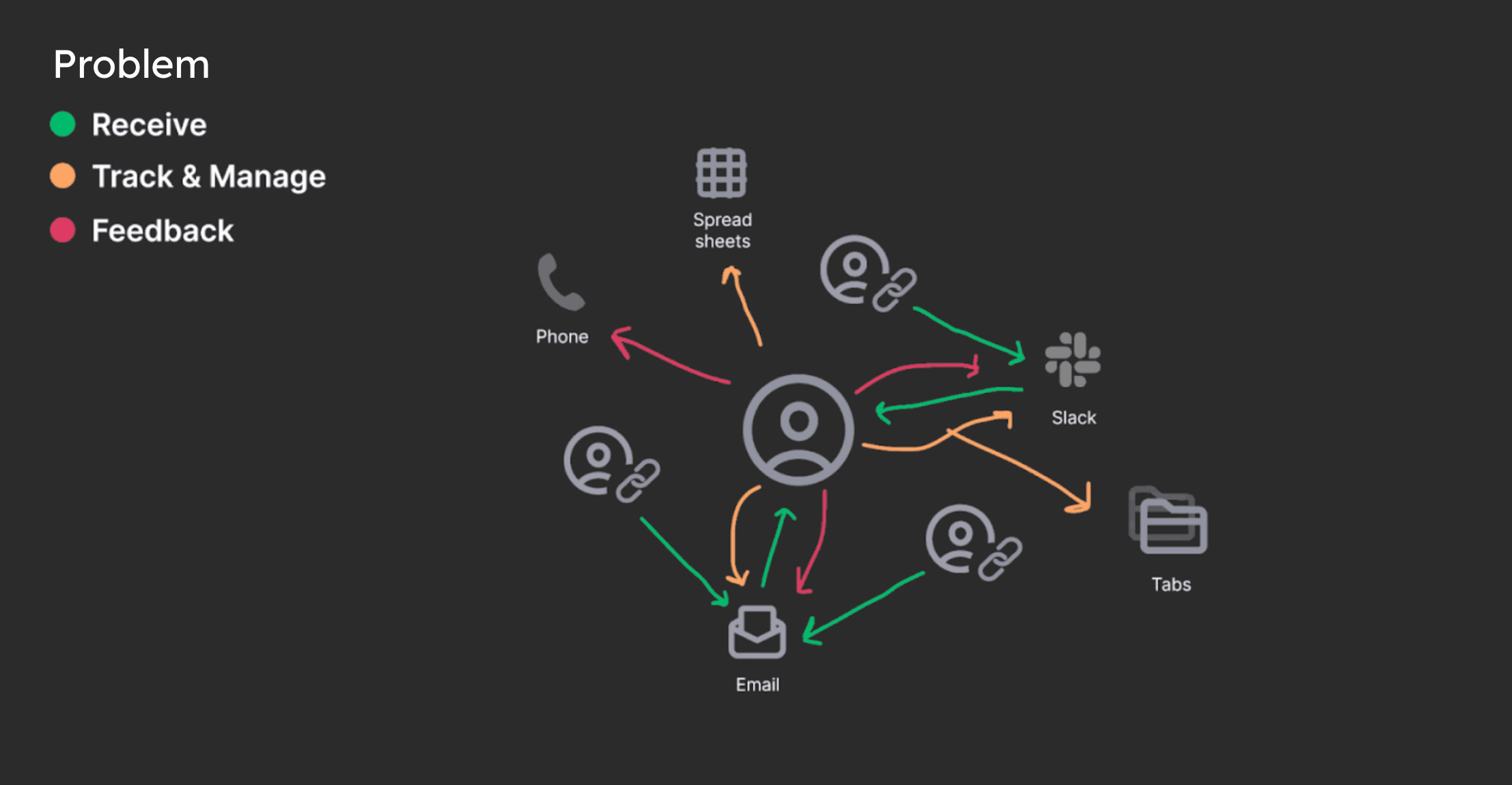
Problem Space
Reviewers lack a unified space where they can quickly access content they need to review in order to streamline their workflow. Because Reviewers receive share links (Reviews) through different channels (Slack, email, etc.) it's difficult to manage their tasks and provide timely feedback, slowing down the review cycle.
Design Goals
Inbox Awareness
A direct channel to Inbox immediately exposes the Reviewer to its key value: a centralized space for their work, driving the behavior we want to encourage.
Fluid Navigation
Reviewers can easily and quickly switch between their reviews without having to search off platform while seamlessly managing high-volume requests.
Smart Tools
Reviewers are empowered by access to tools that guide streamlined workflow, while adapting to their unique working styles and industry needs.
Starting Point
The initial version of Inbox was lacking smart tools such as filtering and useful organization. Additionally, we found that most users were not aware of its existence in the product or did not understand its value.
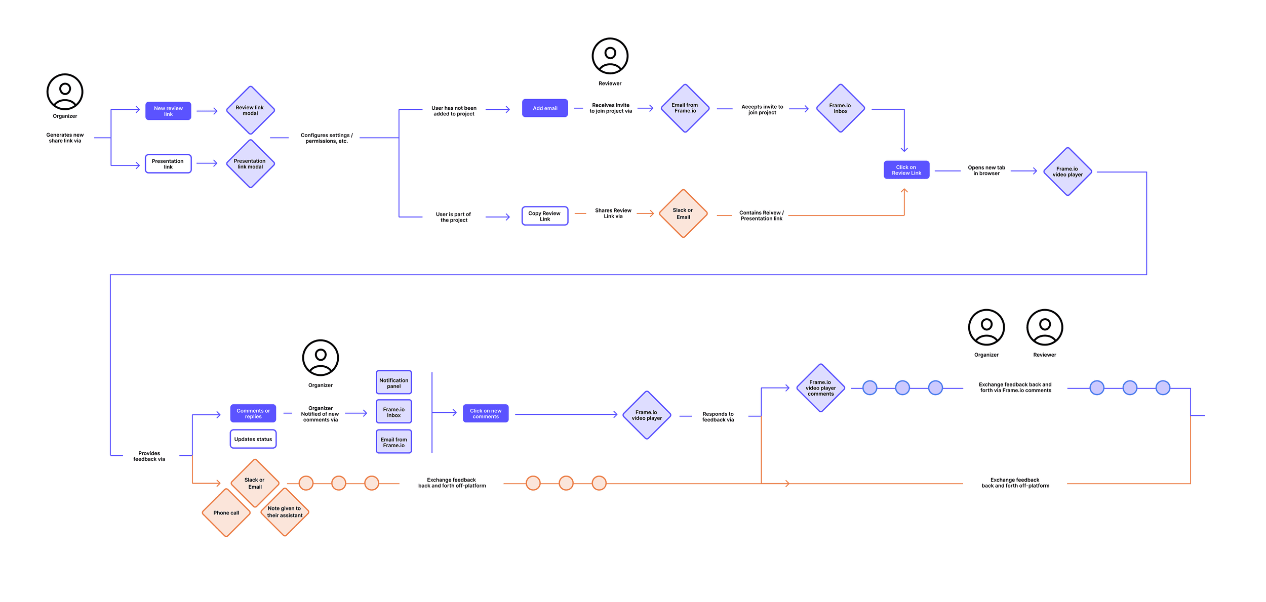
Understanding Industry Workflow
To kick things off, I worked closely with our Workflow Architect who helped with providing industry insights into typical video content review cycles: the key stages, various scenarios, and points of tension. I mapped out the review path for our current product and was able to identify areas where Inbox could help streamline.
Explorations Entry Points
After doing some competitive analysis, I explored two approaches for how to structure the primary user experience.
Direction A
Bring the user directly to the full Share link presentation with the option to navigate to their Inbox and see a list view. From there, they could quickly scan through all of their Share links.
Direction B
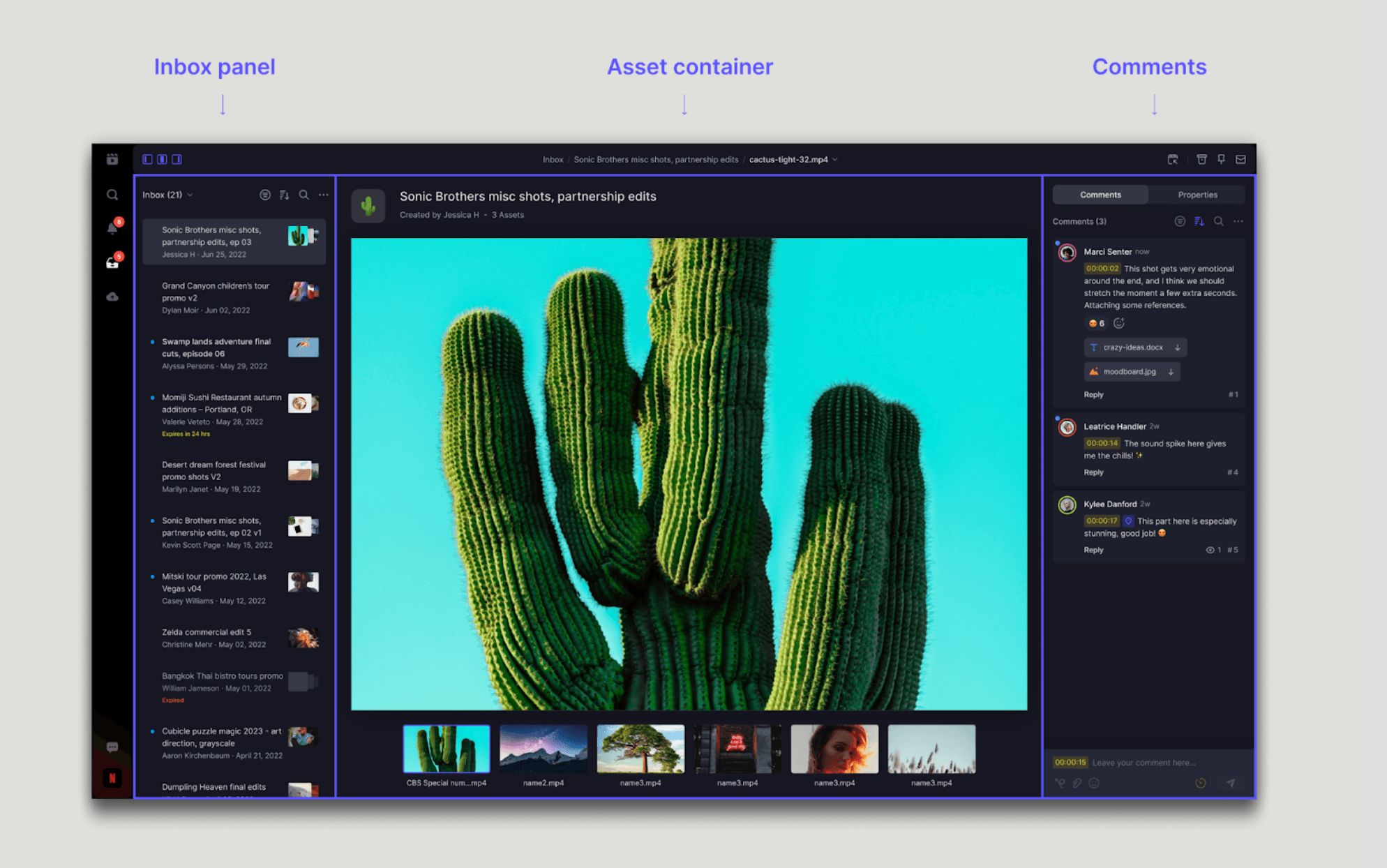
Bring the user directly to their Inbox interface with the respective Share link in focus and Inbox panel automatically revealed so they could quickly see other Share links.
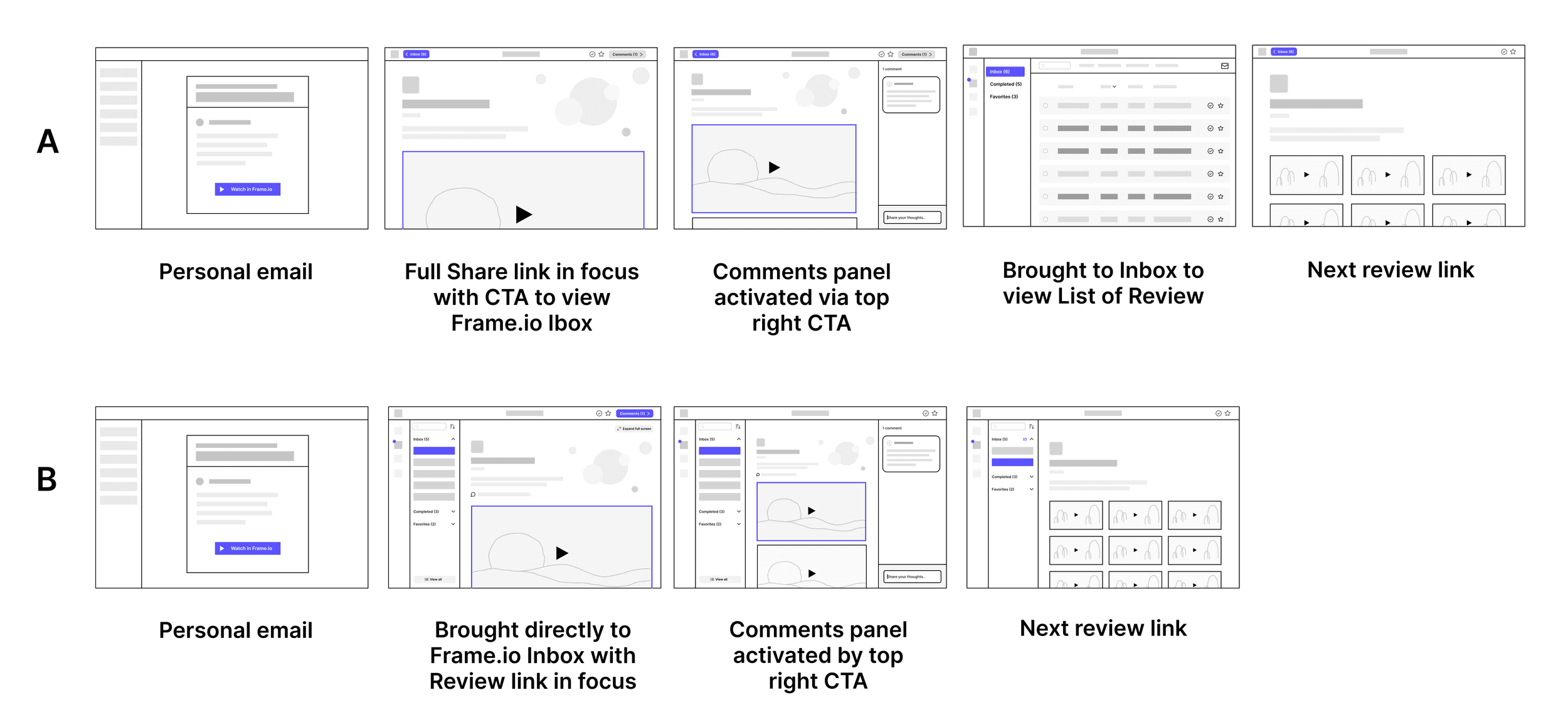
Final
Ultimately I landed on Direction B based on the following principles:
- Inbox education: bringing users directly to their Inbox creates awareness about this centralized space where they can quickly access review requests
- Content-first: Direction B focuses users on the content rather than on a list of review requests. As a compromise, we can always provide the user with an option to view as a list.
- Fluid navigation: Users can quickly click through review requests in the left panel and immediately see the content change.
The tradeoff with this direction is that the asset is not immediately presented in a full screen view as the creator intended. However, the Reviewer can always click on the asset to go into a full screen player mode.
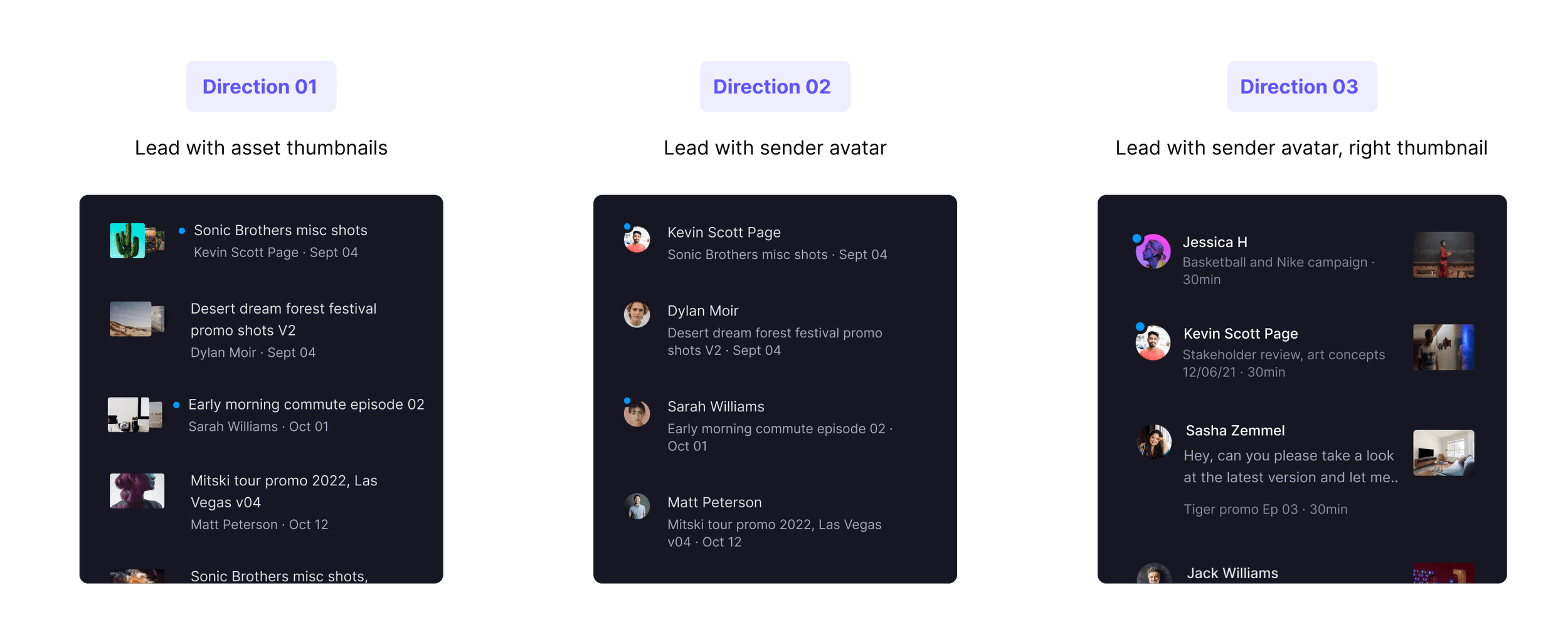
Share Link Cell Metadata
I explored various ways of presenting metadata within the Share link cells. I considered what information would be most useful to a Reviewer when scanning the panel. After reviewing the pros and cons, I landed on leading with the content rather than the sender. While leading with the sender is more typical for standard email clients, the primary focus of Inbox is the content.
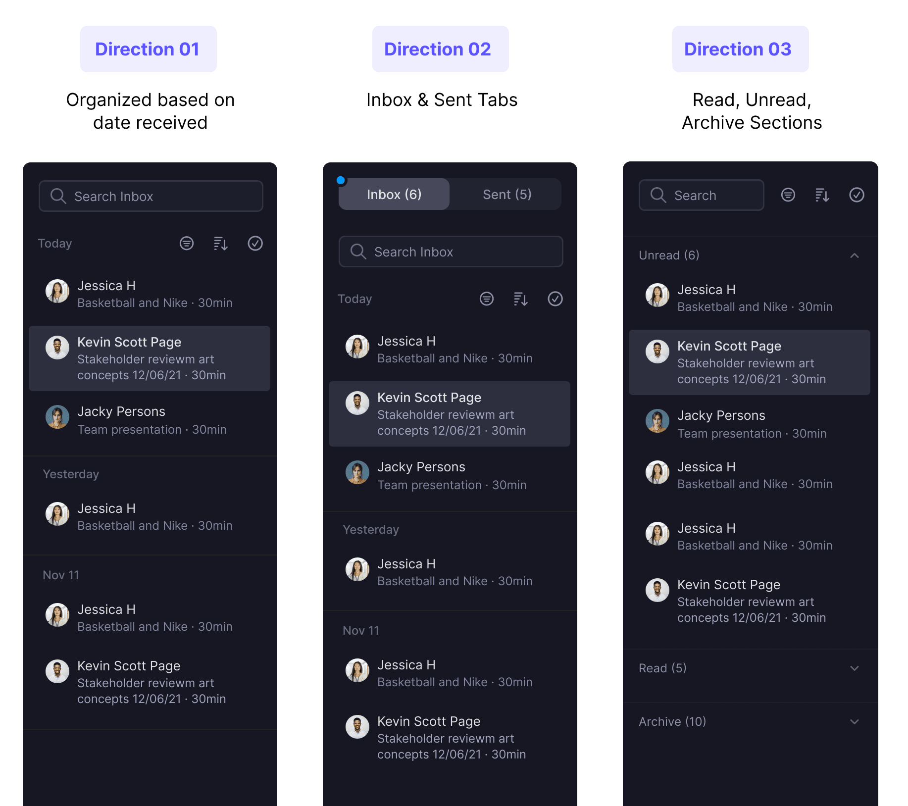
Inbox Panel Organization
I explored various ways of organizing the panel contents while trying to consider an approach that would require the least amount of effort to navigate. Initially I thought it would be useful to separate the share links by date received, but we found that Reviewers don't typically receive several in one day.
Next, I considered separating by read state. After prototyping, I determined that the user experience became jarring and unexpected when navigating through the unread share links. Ultimately, the user could always use the 'unread' filter and quickly archive unwanted items.
Share Link Actions
In an effort to empower Reviewers with the tools they need to manage asset review requests, I explored ways to take quick actions directly on the share link cells.
Option 01: Metadata Overlay
Quick way to access and take key actions. However, the overlay obscures important metadata so we ultimately decided against it.
Option 02: Thumbnail Overlay
Quick access to actions, but we still encounter the problem of obscured data. The small space makes this less scalable.
Option 03: Overflow Menu
While less discoverable, the overflow menu is a more standard and familiar pattern. It also offers more options which helps educate people on other actions.
Streamlined Workflow
The new Inbox interface offers users the ability to streamline their process: All review requests are centralized in one location with the ability to seamlessly navigate between them and leave feedback without ever having to leave their Inbox.