Netflix
Enterprise Design System
An expanded design system based on product-specific requirements. The new library empowers designers to meet the unique business-needs of their customers via Content Hub.
Lead Product Designer
Design Manager, 5 Product Designers, 2 Product Managers, 1 Engineering Lead
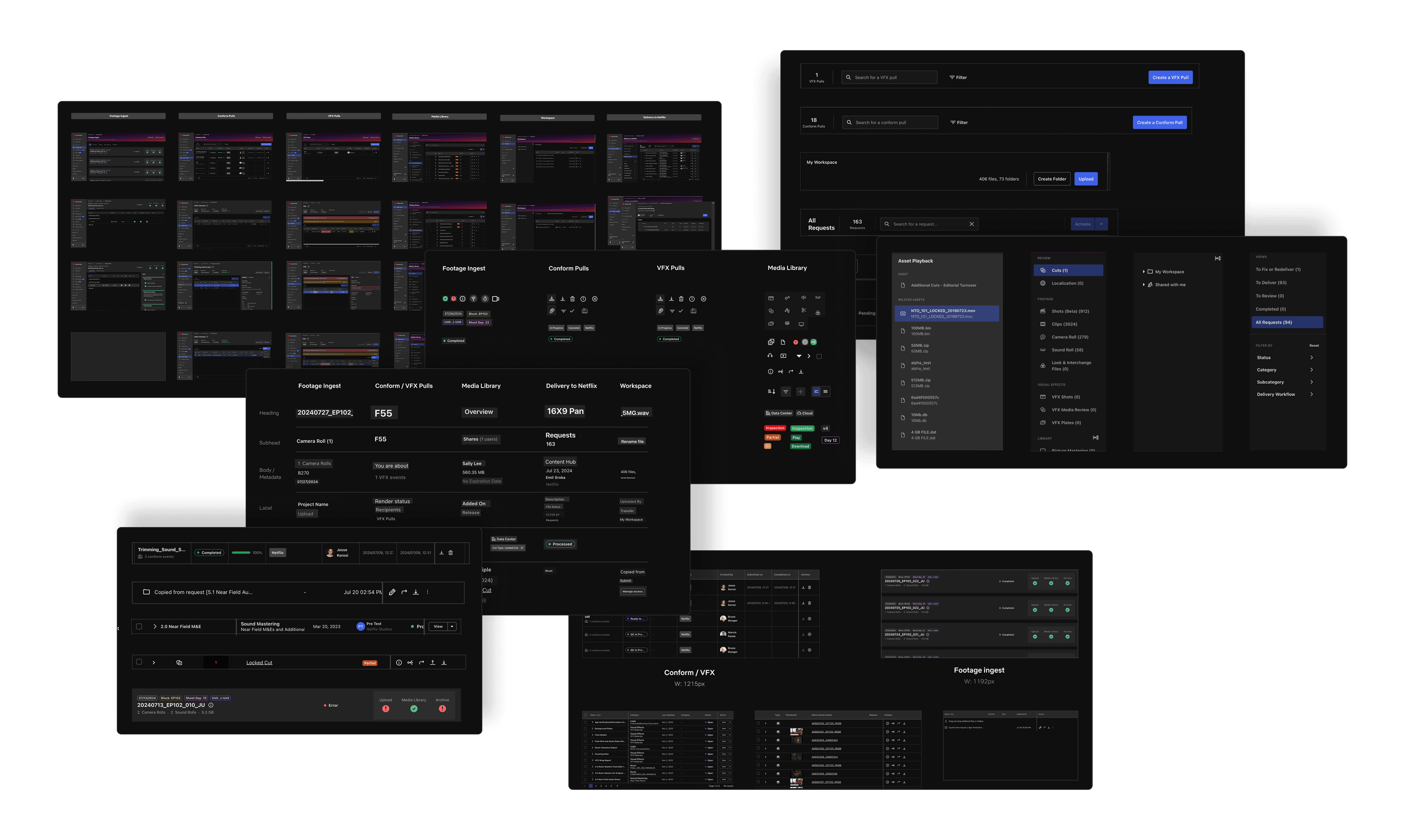
Context: What is Content Hub?
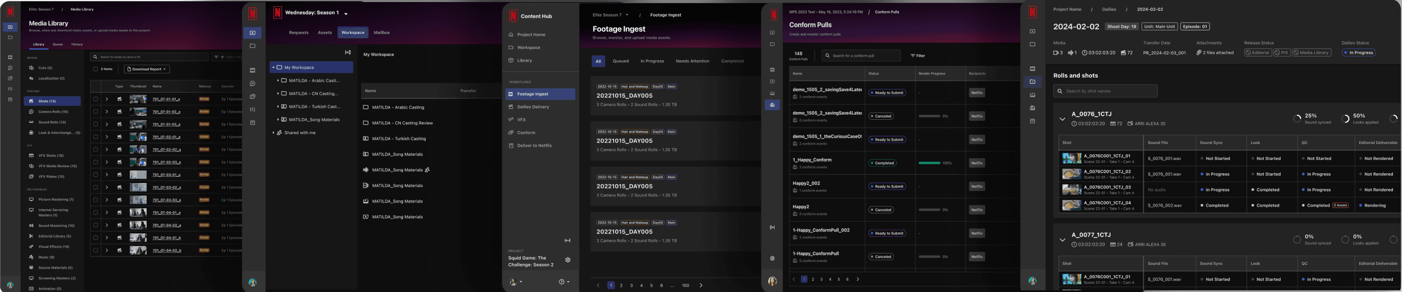
Content Hub is a robust platform that supports post-production workflows and studio operations teams (over 7k daily users). There are 5 primary surfaces that cover various stages in the production cycle.
Problem
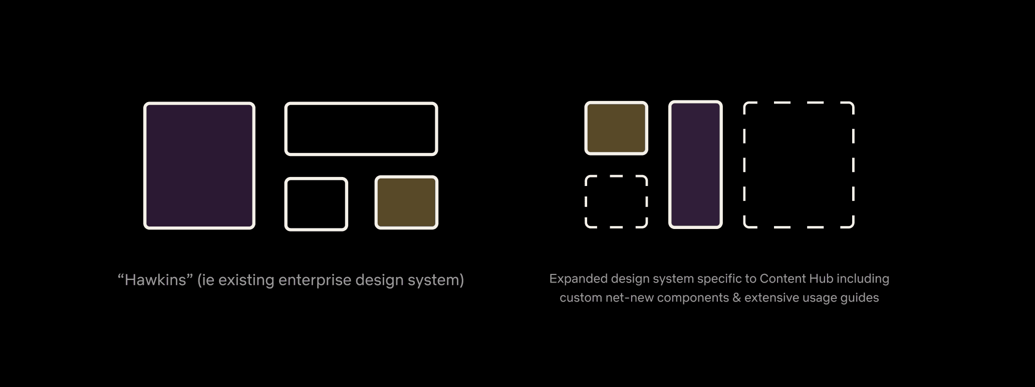
Content Hub designers lack the components needed from Hawkins (Netflix's Enterprise Design System) to serve the business goals of their users.
Solution: Deliver an Expansion Pack
My role was to deliver an extended net-new library specific to the Content Hub product. This expansion pack would serve the needs of 5 product designers across all surface areas.
Goals
Standardize
Offer consistency across all surface areas. Upon identifying key opportunities, not only up-level the library, but also standardize components across the platform.
Guide
Provide clear, actionable guidance for how components are used including the use cases which they should be leveraged. Cover foundational styles and mature components.
Templatize
Build one componentized, out-of-the-box template for designers to grab as a starting point to eliminate the need to re-design their surfaces.
Discovery
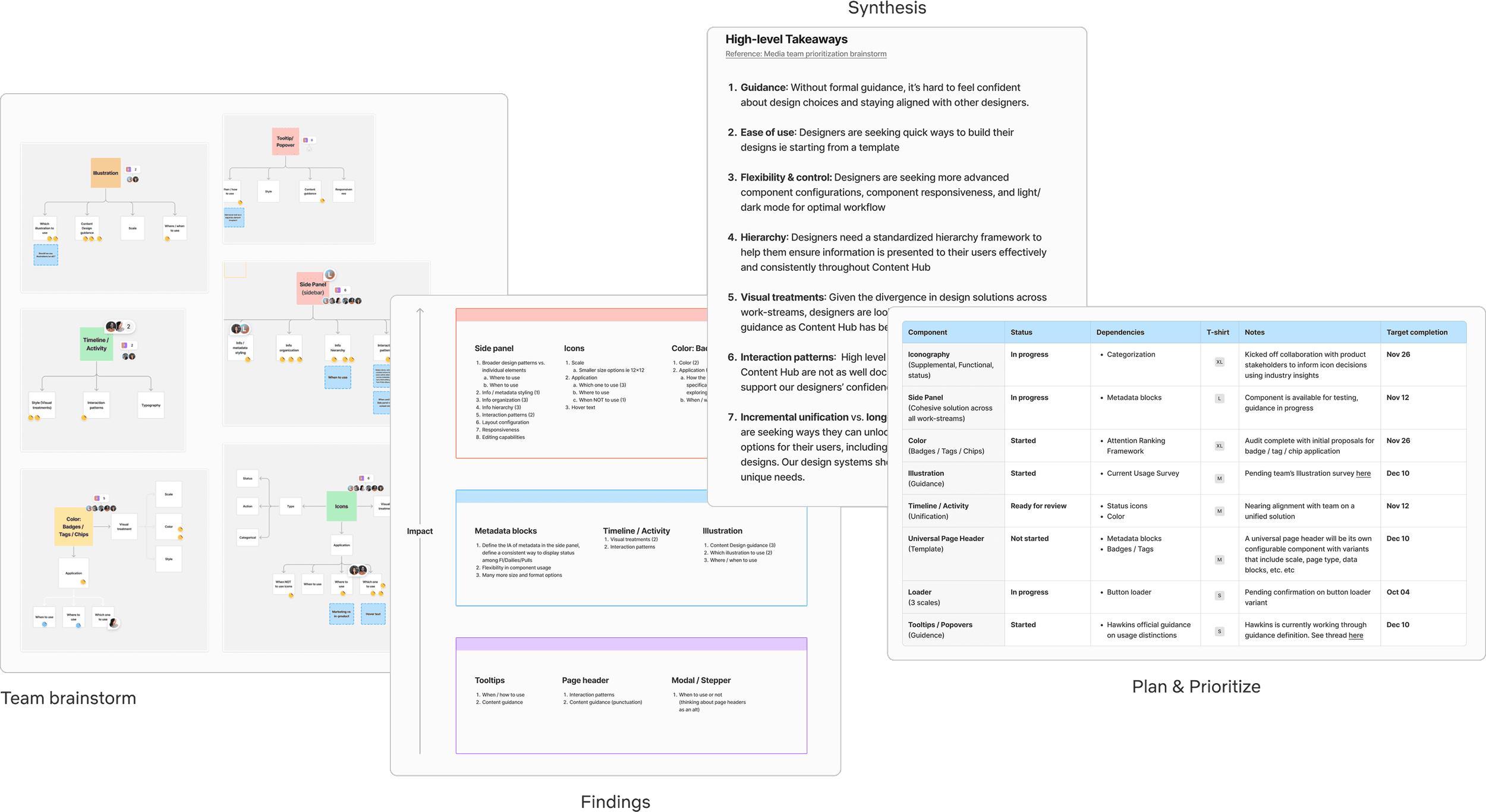
Step 1: Audit
The first step was to conduct a large scale audit across all surface areas, evaluating typography, color, iconography, components, layouts, and more. I identified a robust list of opportunities.
Step 2: Team Workshop
Based upon the opportunities I identified, I had the team think about which ones would ultimately offer the most impact in their workflows. I ordered the impact areas, synthesized high level takeaways, and concluded with listing the items in a roadmap format.
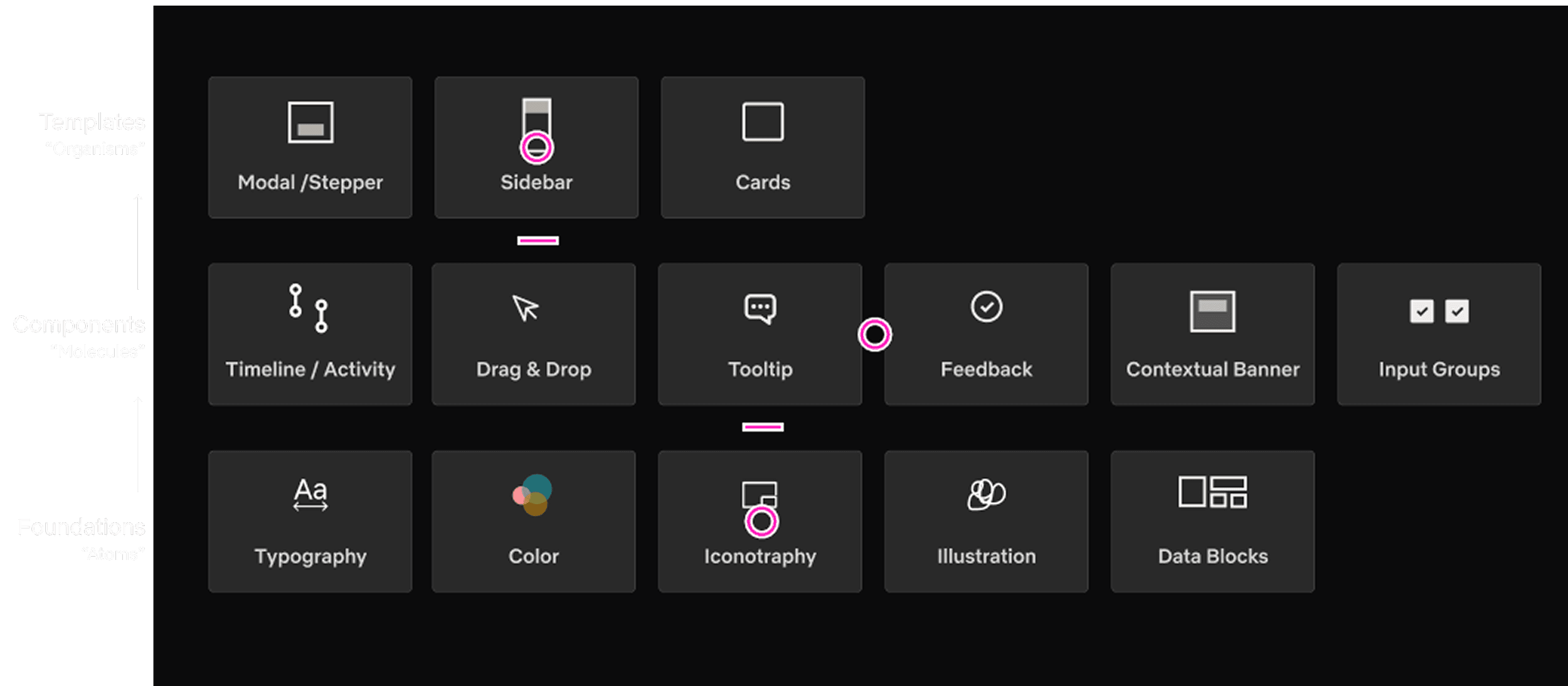
Step 3: Visualize
In an effort to help stakeholders visualize my plan, I created this artifact based on the atomic model.
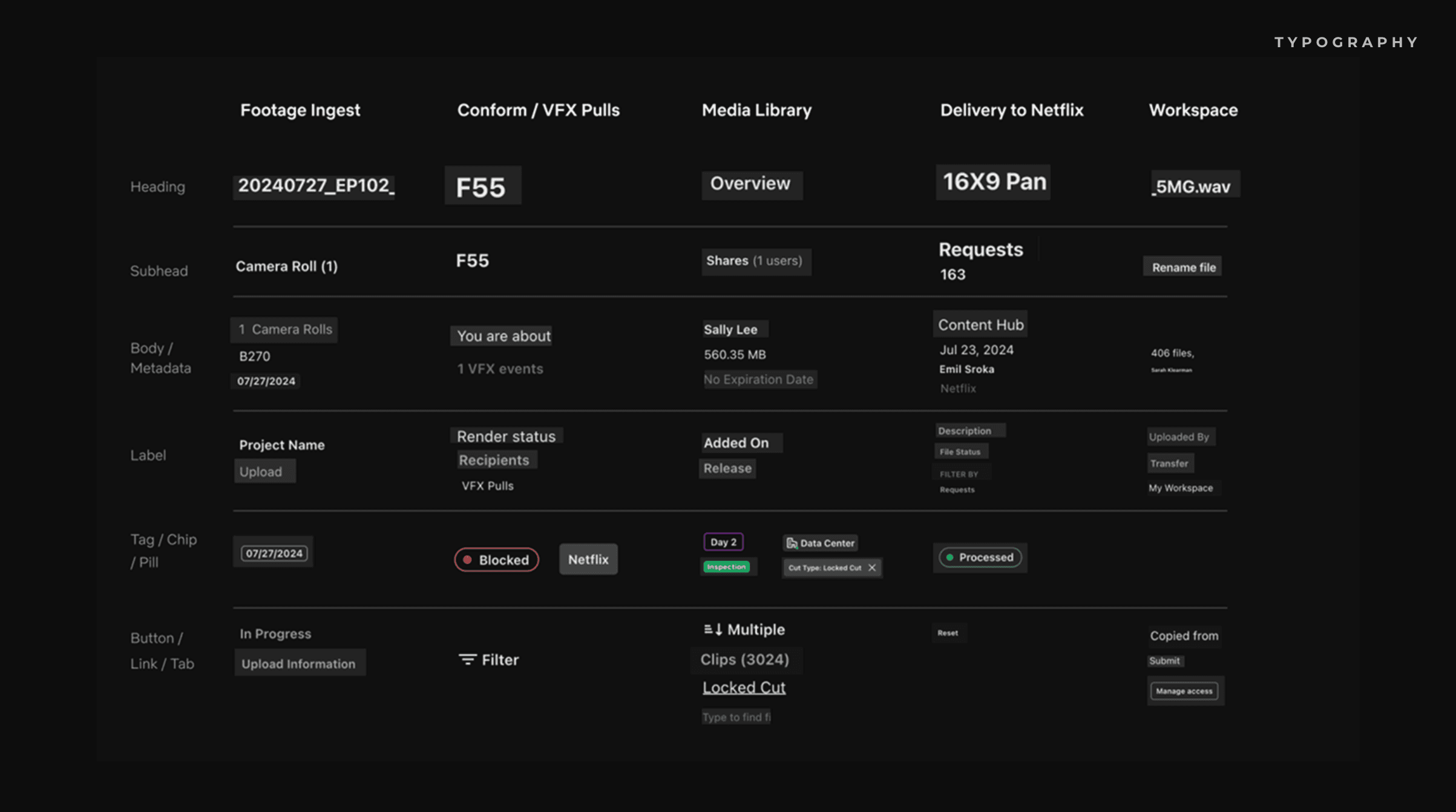
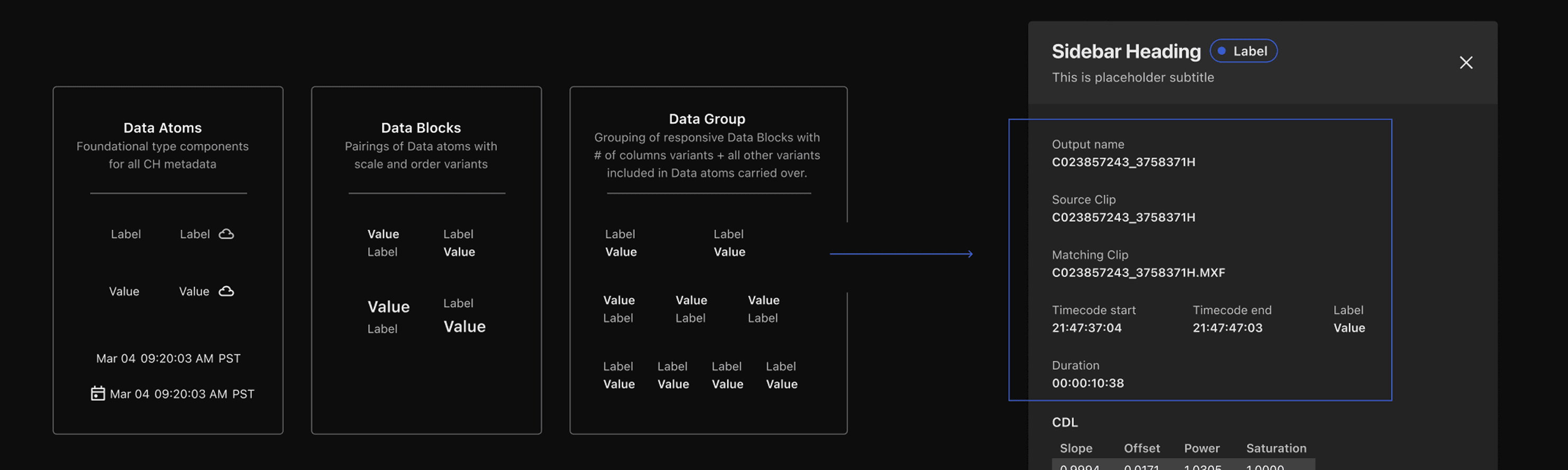
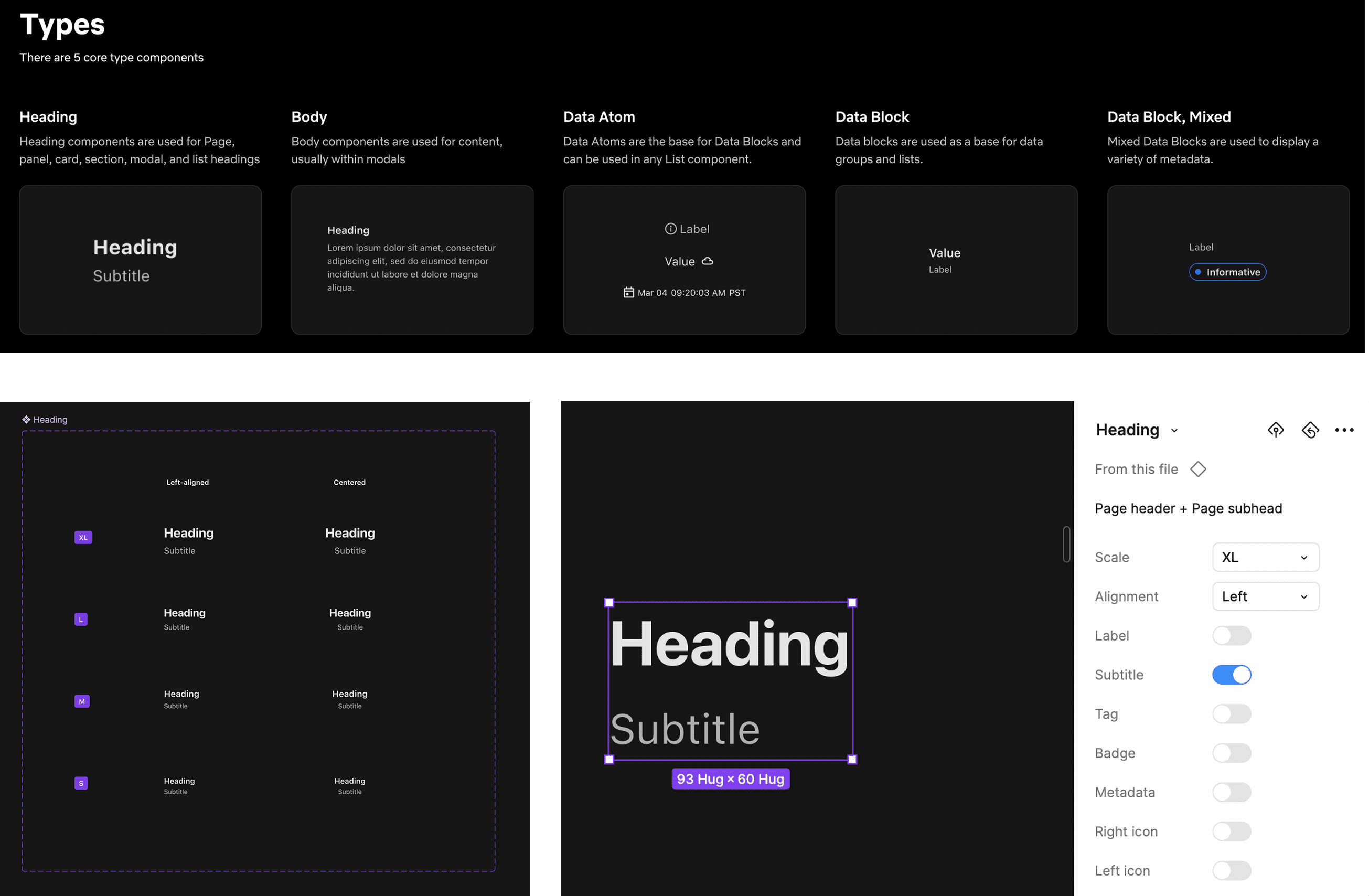
Typography
As a key foundational style, I kicked off the project with typography, starting with an extensive audit. After the audit, I developed a 'data' style system. 'Data' includes 2 type concepts: Values and Labels — the two most common styles across Content Hub. These became atoms. From there, I built up into 'Data Blocks' and 'Data Groups'. Designers can use these building blocks to create various type-heavy layouts.
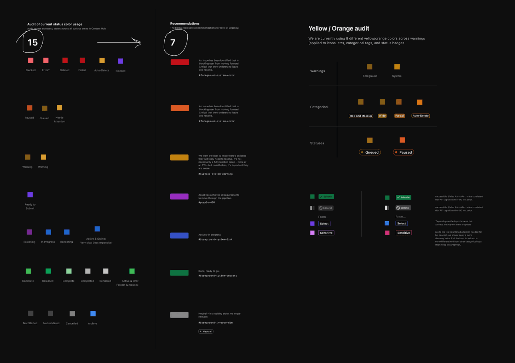
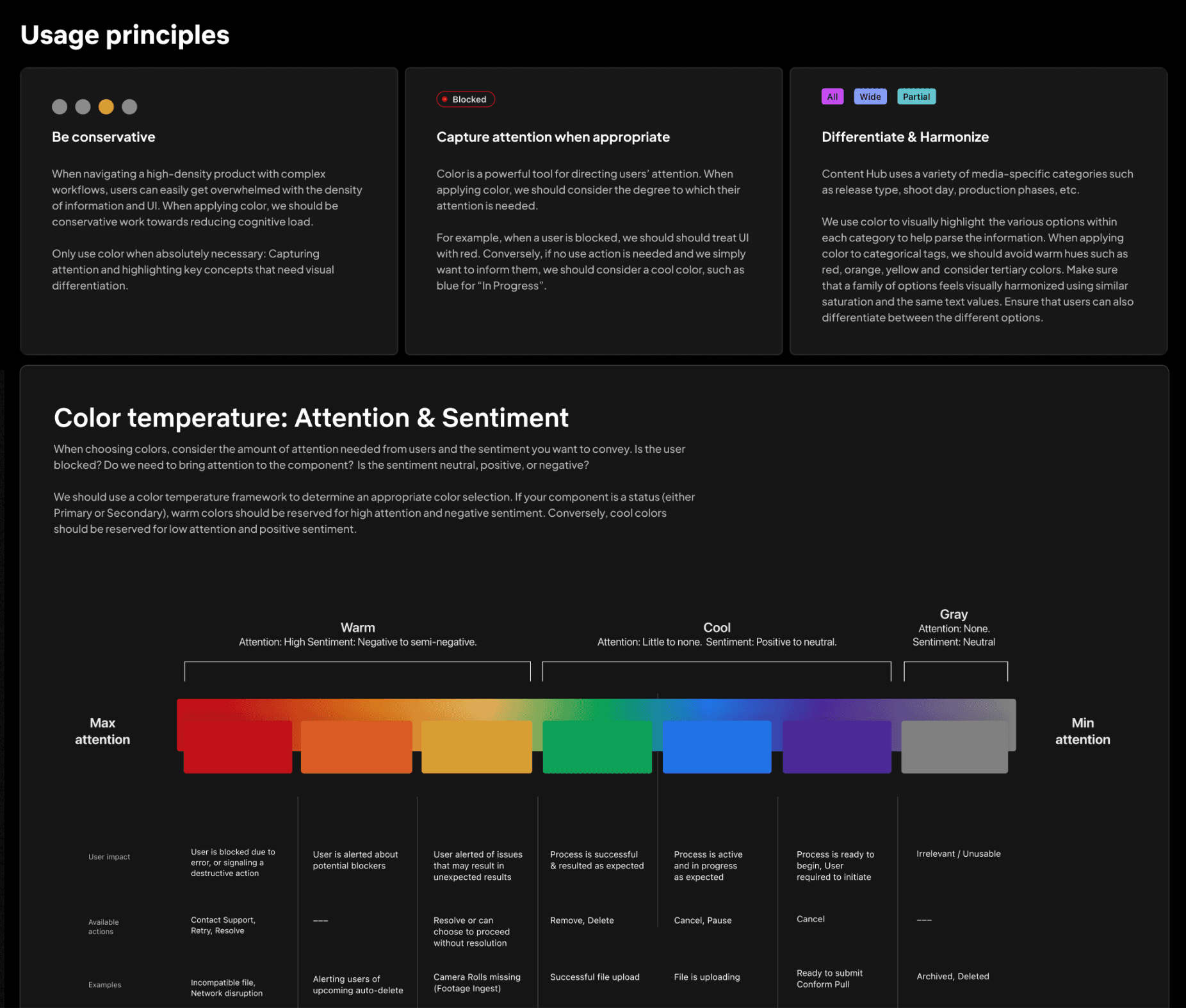
Color
Through my color audit, I identified 15 different colors used differently across all surface areas including labels, badges, icons, etc. I was able to distill this color library down to 7. These colors also needed to account for dark / light mode.
Iconography
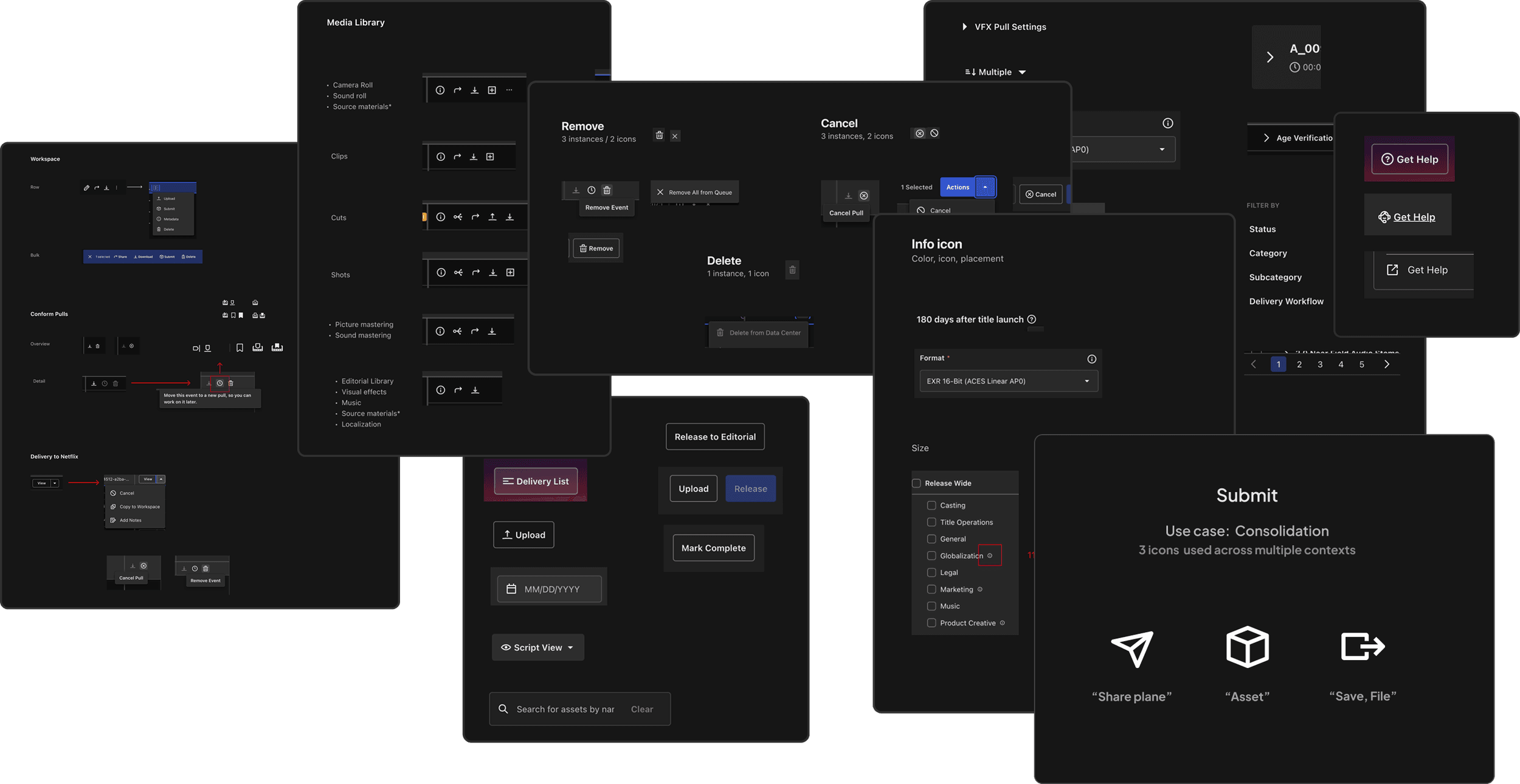
Iconography plays a critical role in Content Hub since they not only signal actions, they represent highly nuanced production concepts in the film industry. Beginning with an audit, I identified style inconsistencies, and usage differences across surfaces areas.
Our Product partners had a stake in iconography given their deep knowledge of production processes. In order to align on a consistent set of icons, I facilitated an association exercise to identify concept mental models.


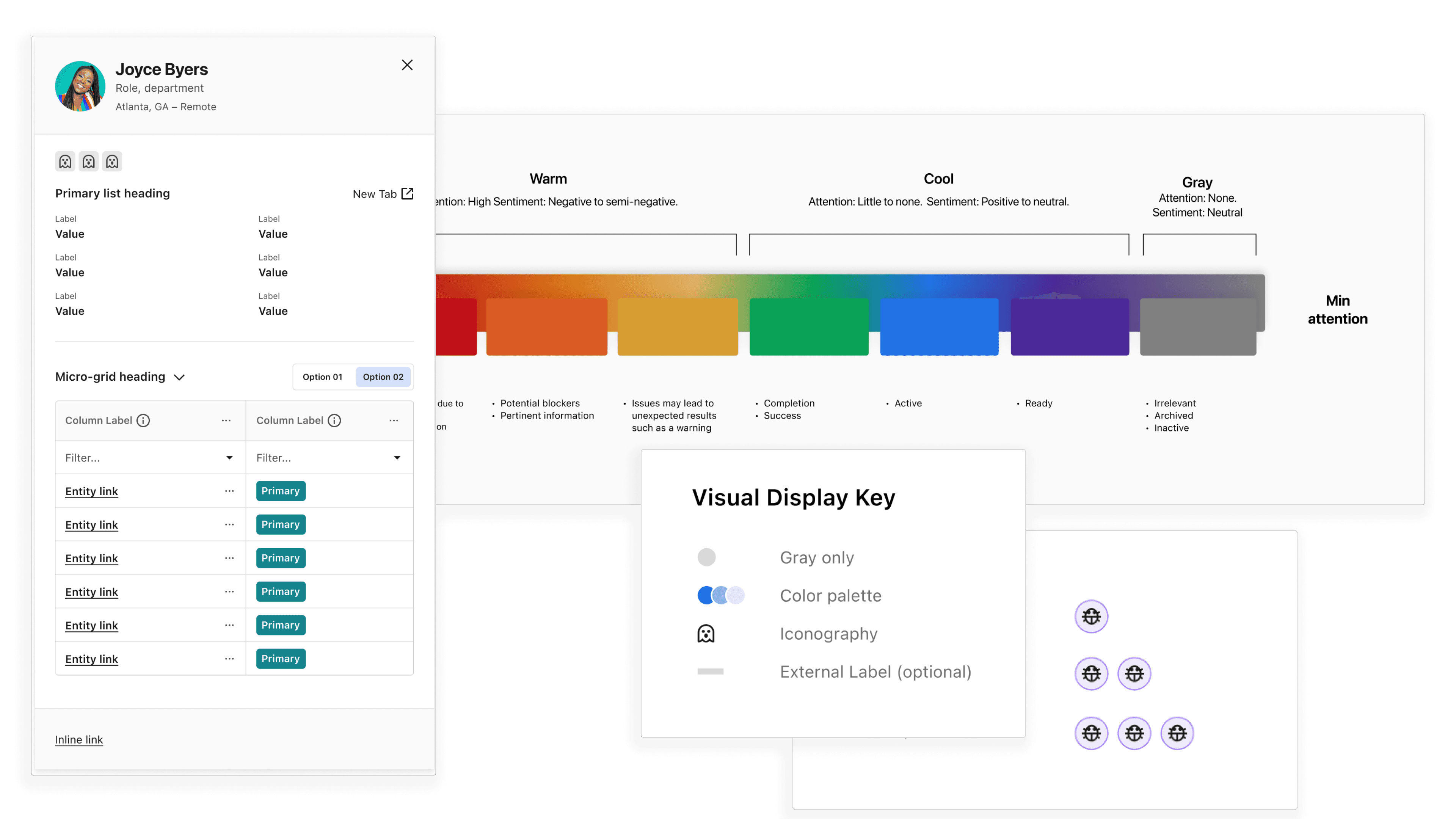
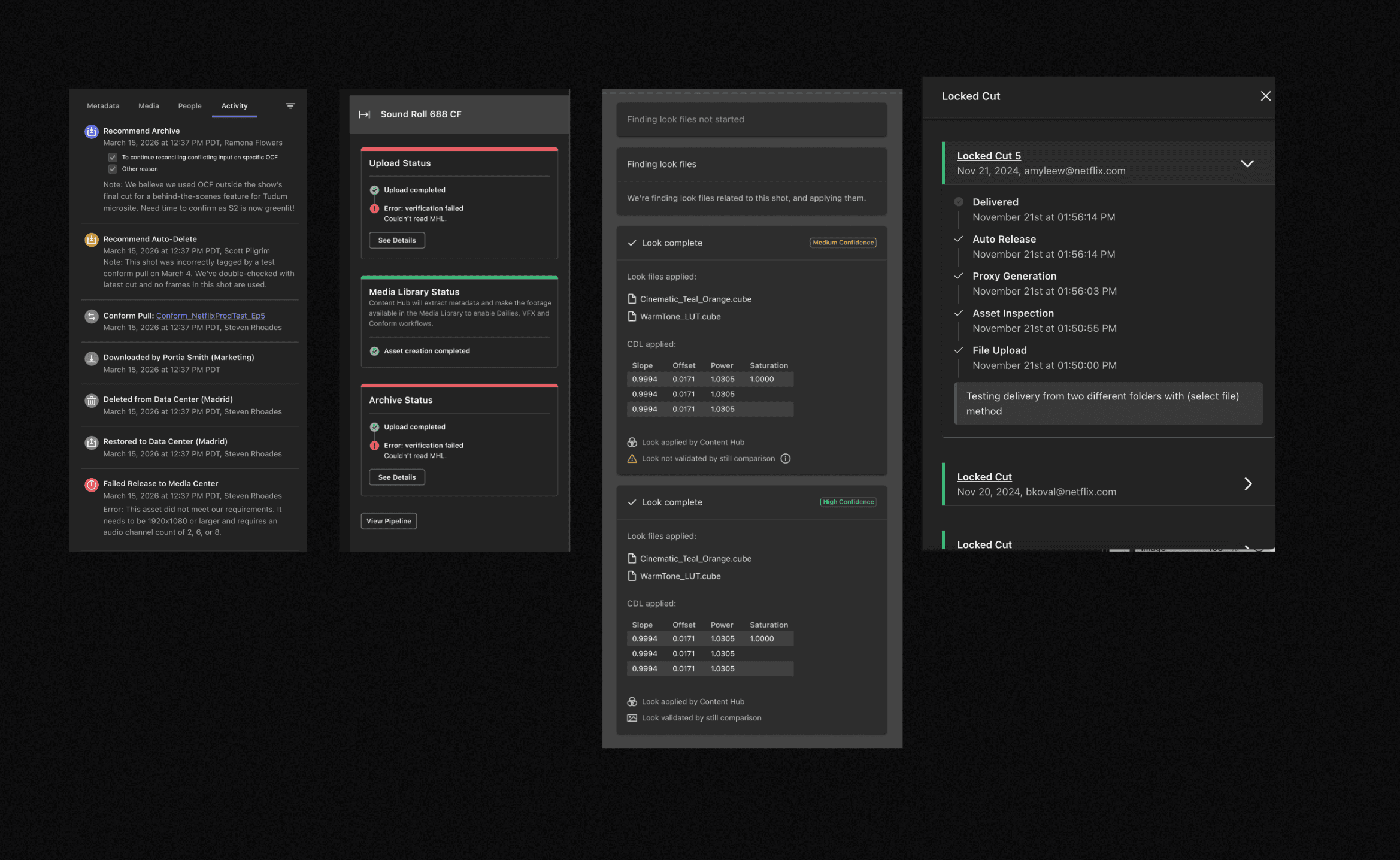
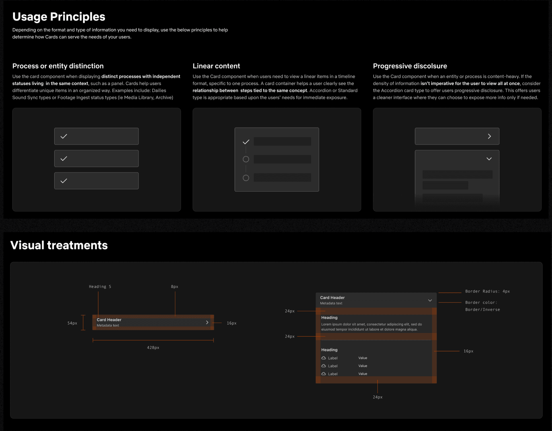
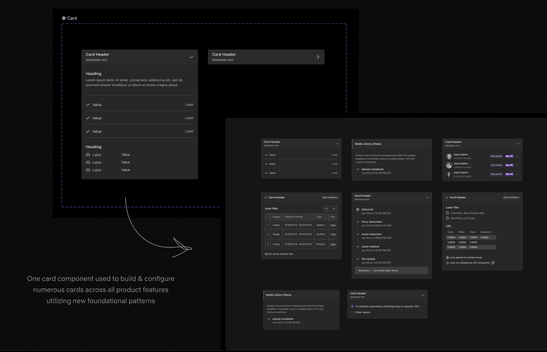
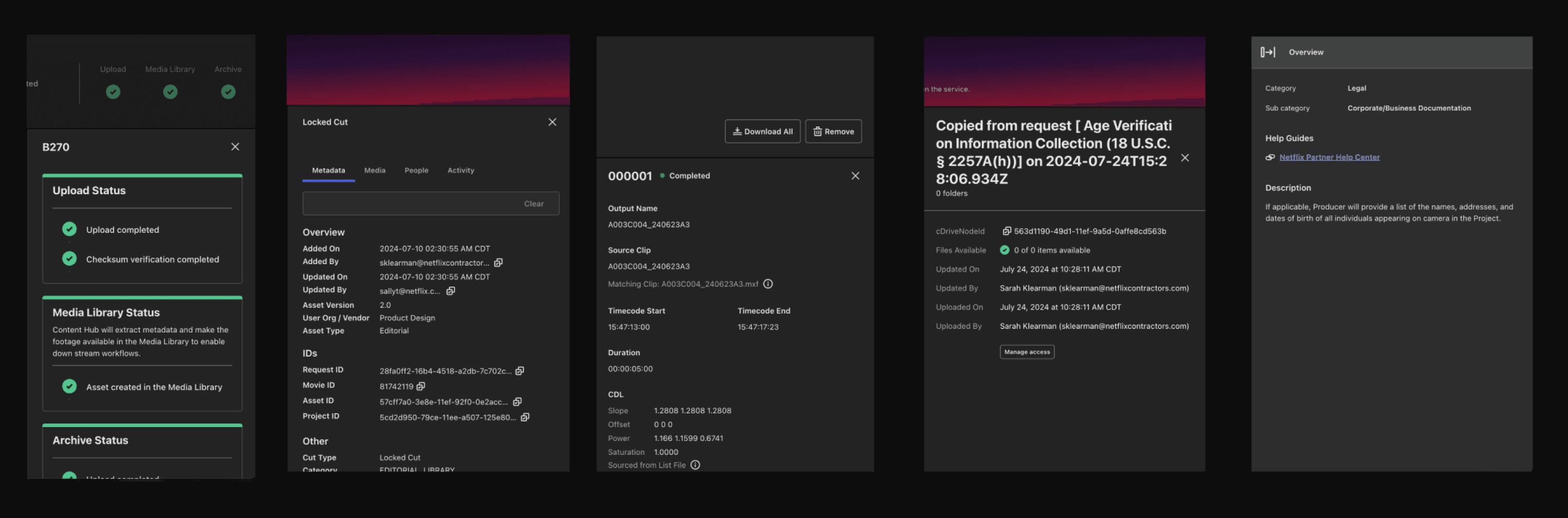
Cards
Cards contain complex production data that lives within the Side Panel. Each card functions differently depending on the surface area. After completing an audit across the surface areas, I began an exercise in standardizing the patterns, components, and overall layout using the foundational styles I established from the start.
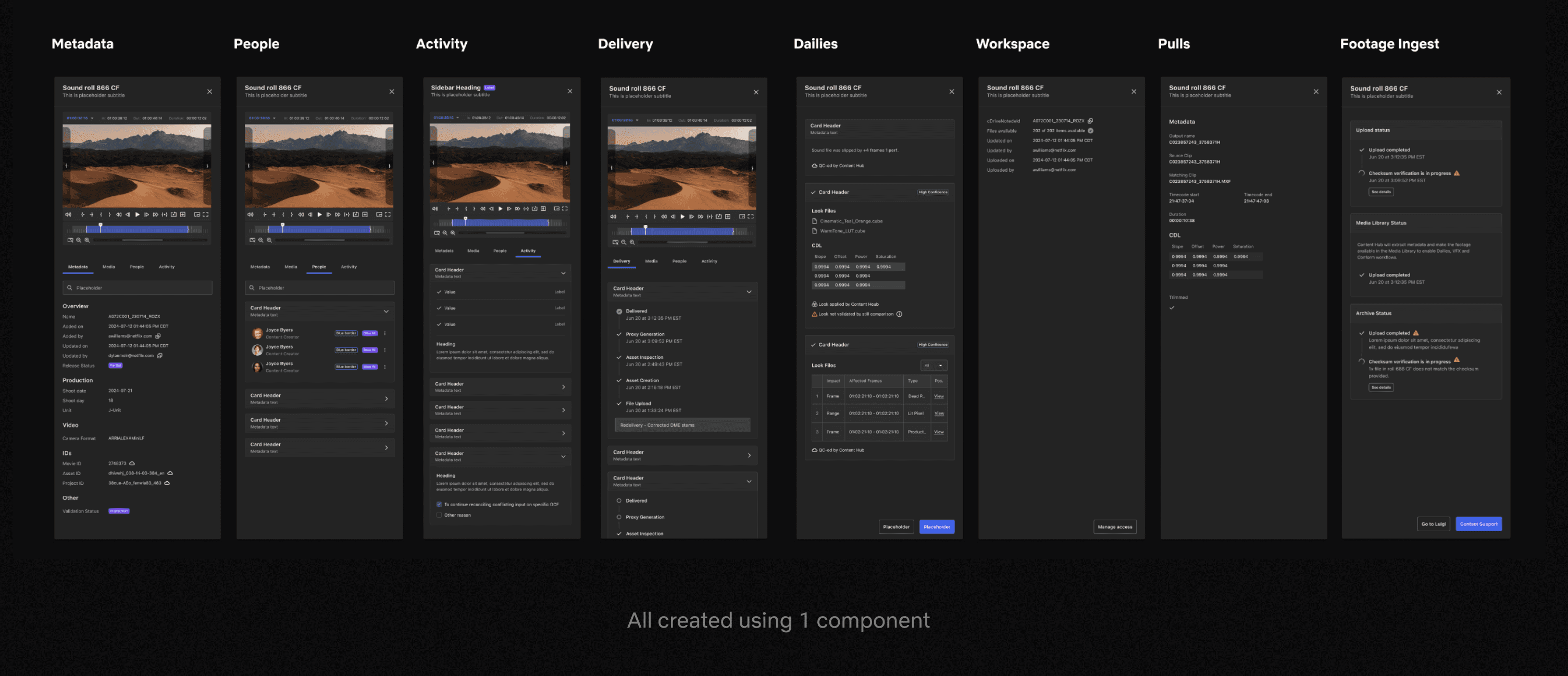
Side Panel
After completing an audit across the surface areas, I began an exercise in standardizing the patterns, components, and overall layout. The second image shows the 8 use cases created from a single Side Panel component.
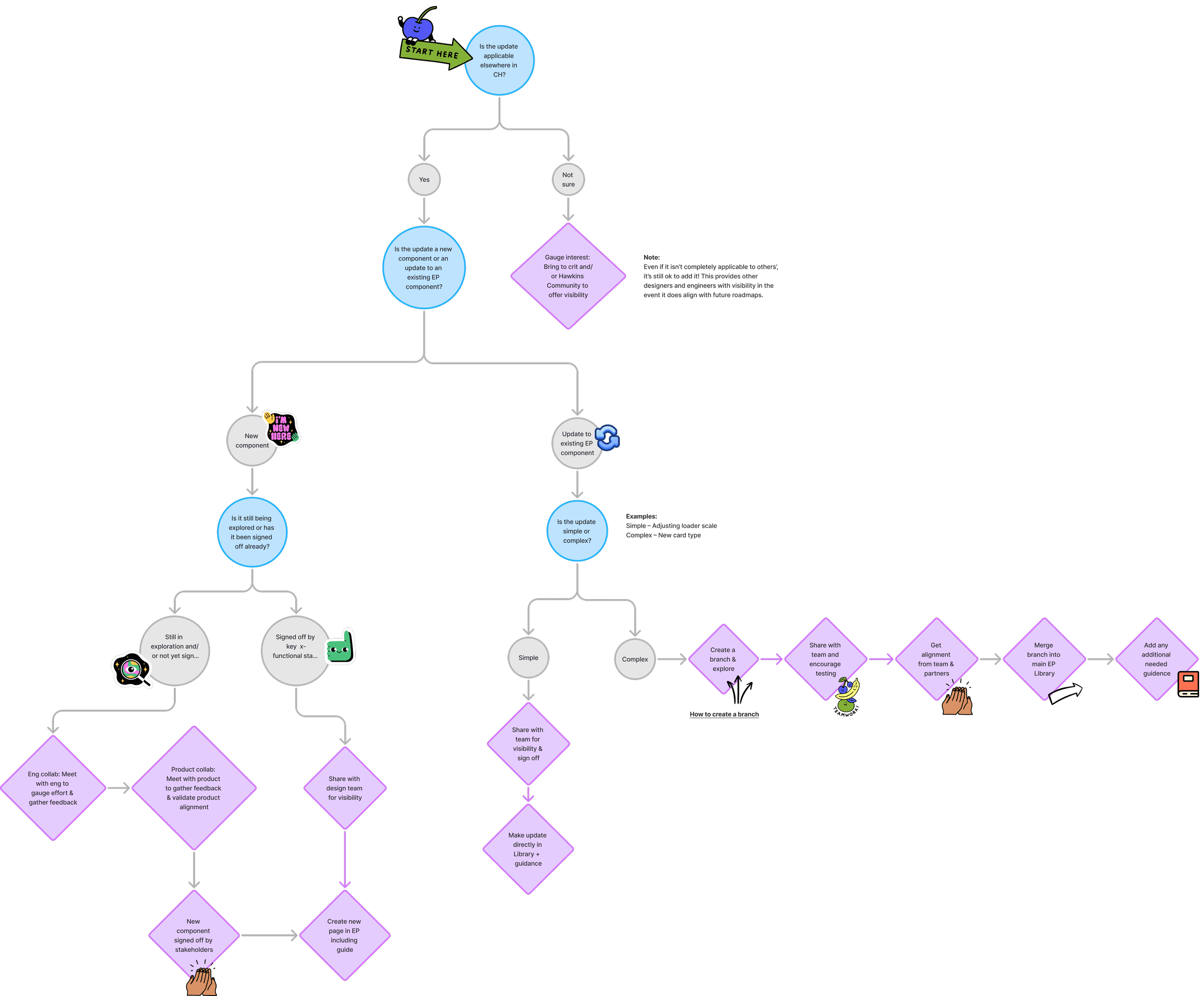
Maintenance Guide
As I wrapped up the Expansion Pack library, many of the designers were curious about how to maintain the eventual updates. I put together this journey map as an aid for thoughtfully evolving the library, including how to involve cross-functional partners.