A/B Testing Tool (Disney Streaming)
Empowering Disney Streaming’s global programming team to run A/B tests on the browse experience
My role: Lead product designer
Collaborated with: Product Manager, Engineering Lead, Design Manager
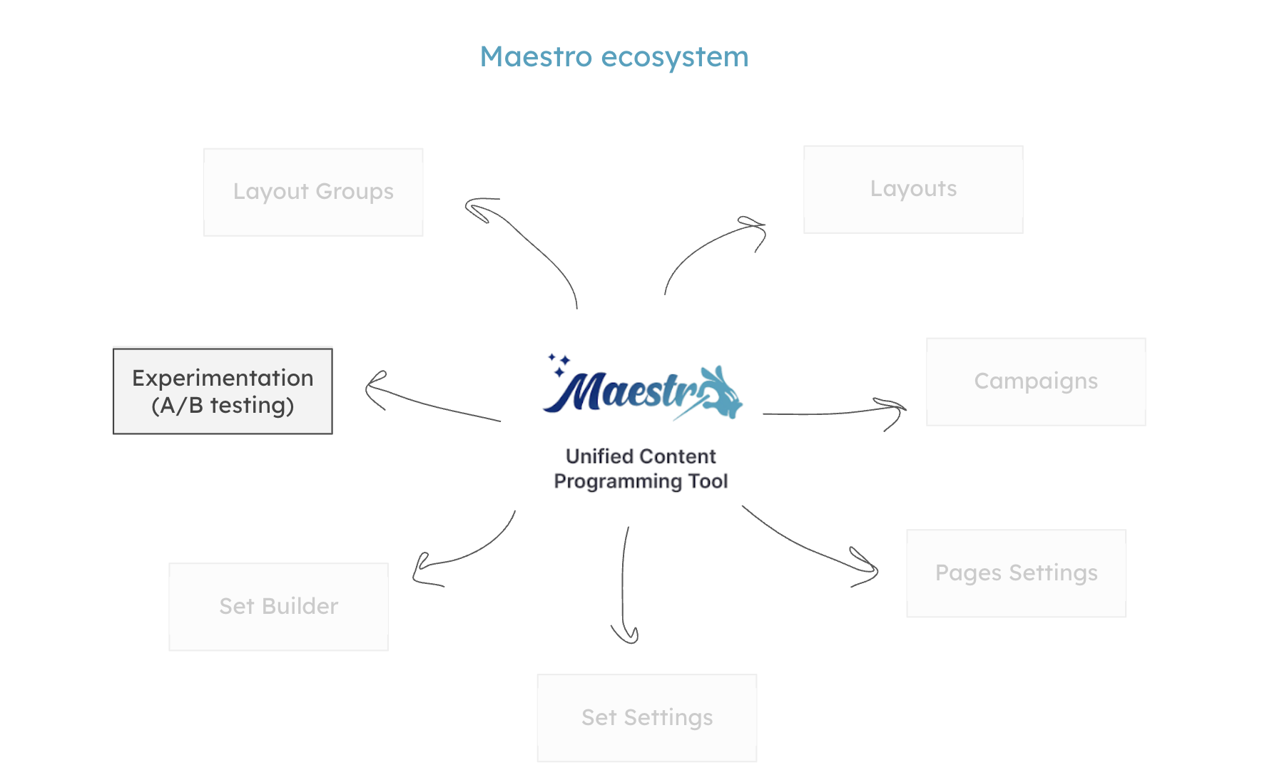
Context: What is Maestro?
Following the 2019 Hulu Acquisition, Disney+ ingested catalog of 2.5k more titles. As a result, we created a unified content programming tool (Maestro), which I owned end-to-end.
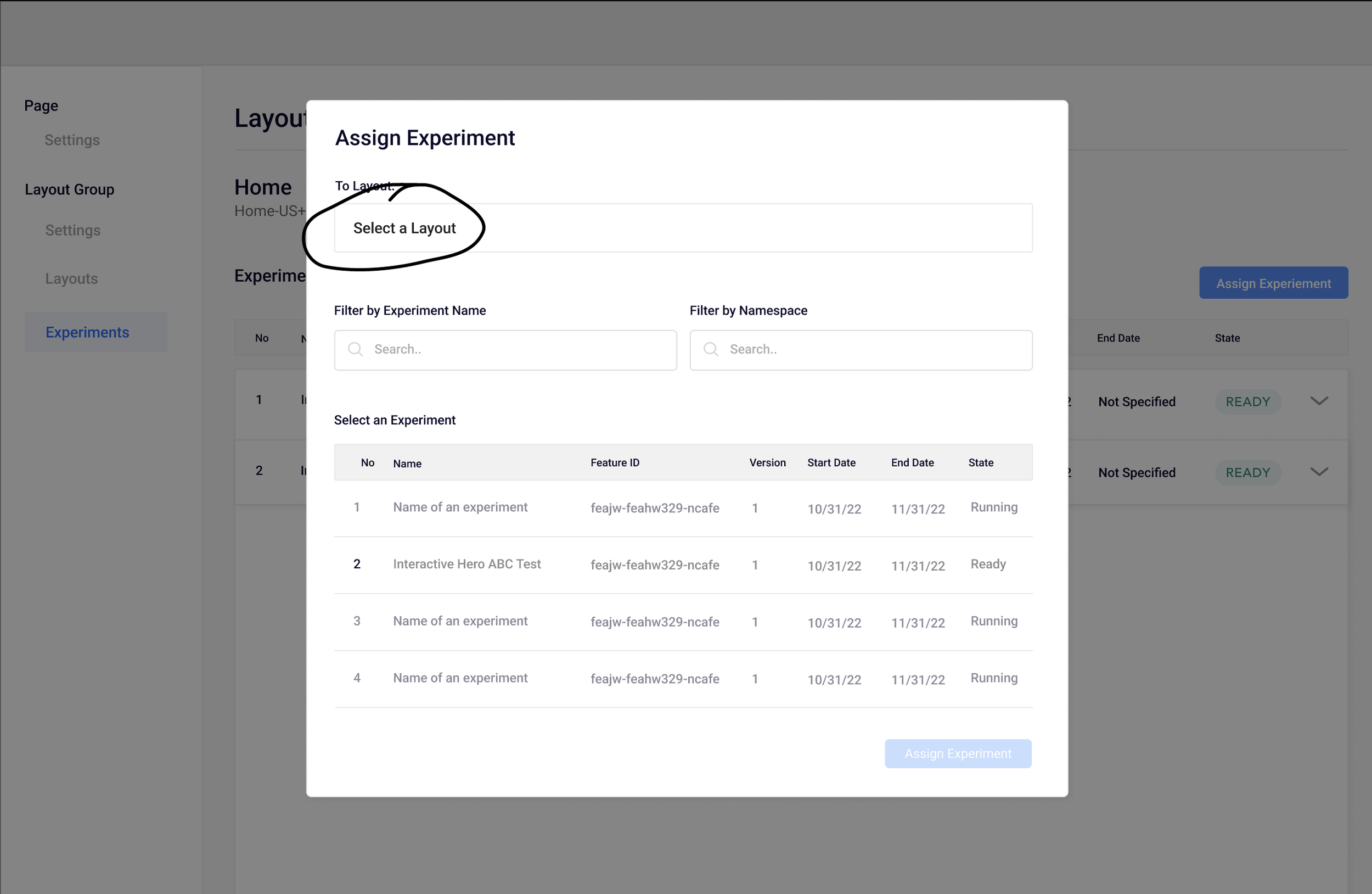
Within the ‘Maestro’ ecosystem, I designed the ‘Experimentation’ feature: a robust A/B testing product used by the content Curators to gather performance data, informing future curation strategy.

Problem
Running consistent A/B tests is essential to Disney Streaming’s business in order to deliver viewers the most optimal content selections. Users of Maestro (ie Curators) need a feature to run A/B tests based on programming strategies while also effortlessly integrated within Maestro.
Discovery
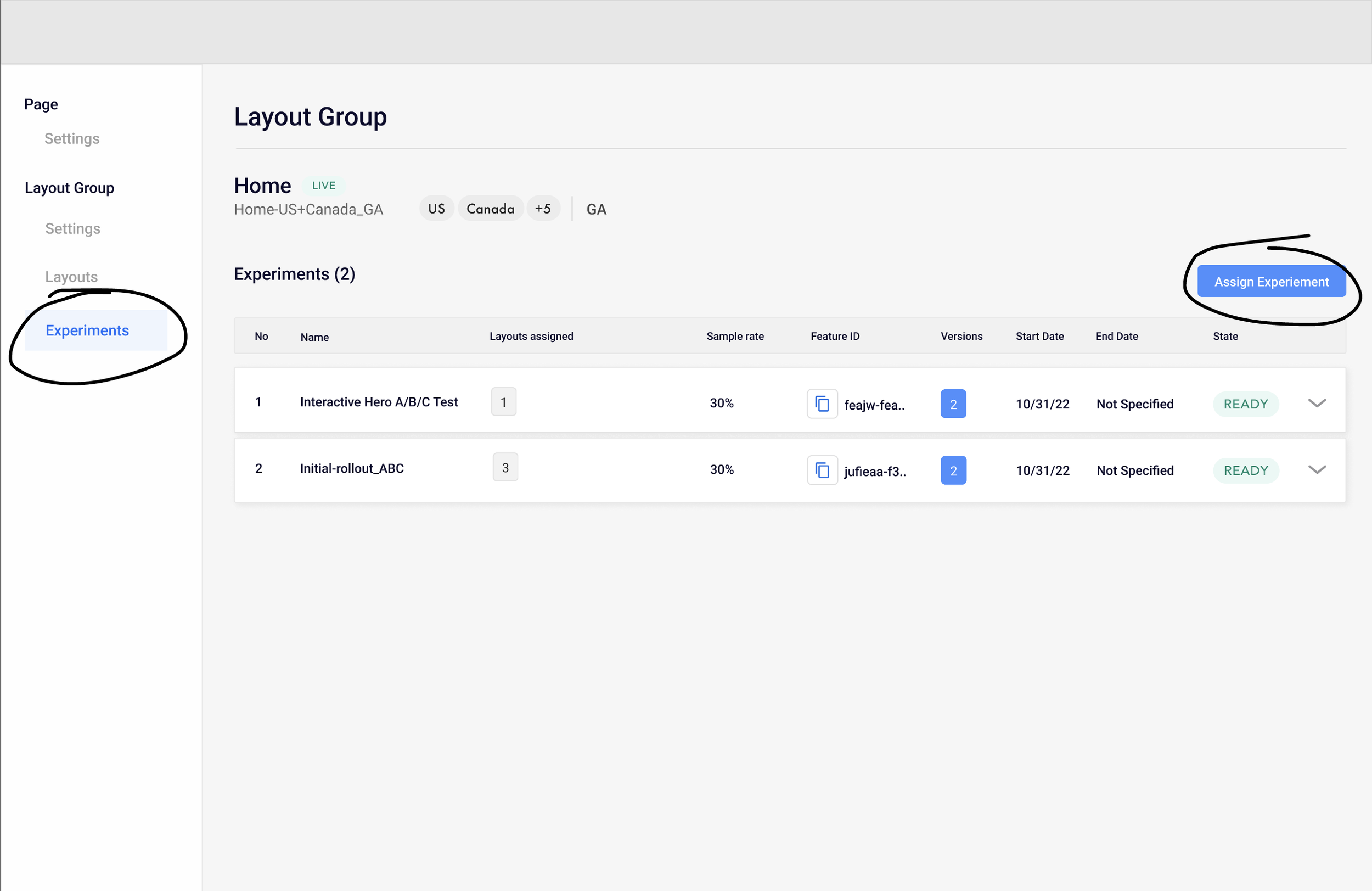
The Experiment solution (ie A/B testing tool) was informed by legacy feature in Disney’s programming tool. Below are screenshots I used for reference when identifying key opportunities:


IA & User Journeys
Prior to wire-framing, I mapped out solutions for integrating the Experiment feature within Maestro, shown below. This process required refinement when collaborating with my product partner and lead engineer, which informed the back-end structure.
Once we dialed in the information architecture, I began mapping out the user journey.

Initial concepts (wireframe prototype here)
Direction 01 – New surface area:
Build a new page within Maestro as a separate workspace for Curators to navigate to and manage their Experiments.
Cons
Requires users to leave Layout context where they need to see live content
The extra data is not necessarily useful and slows performance
Pros
Not all users create or manage experiments, so adding a new surface offers a distinct workspace
Future-proof: extends a future pattern to be introduced later

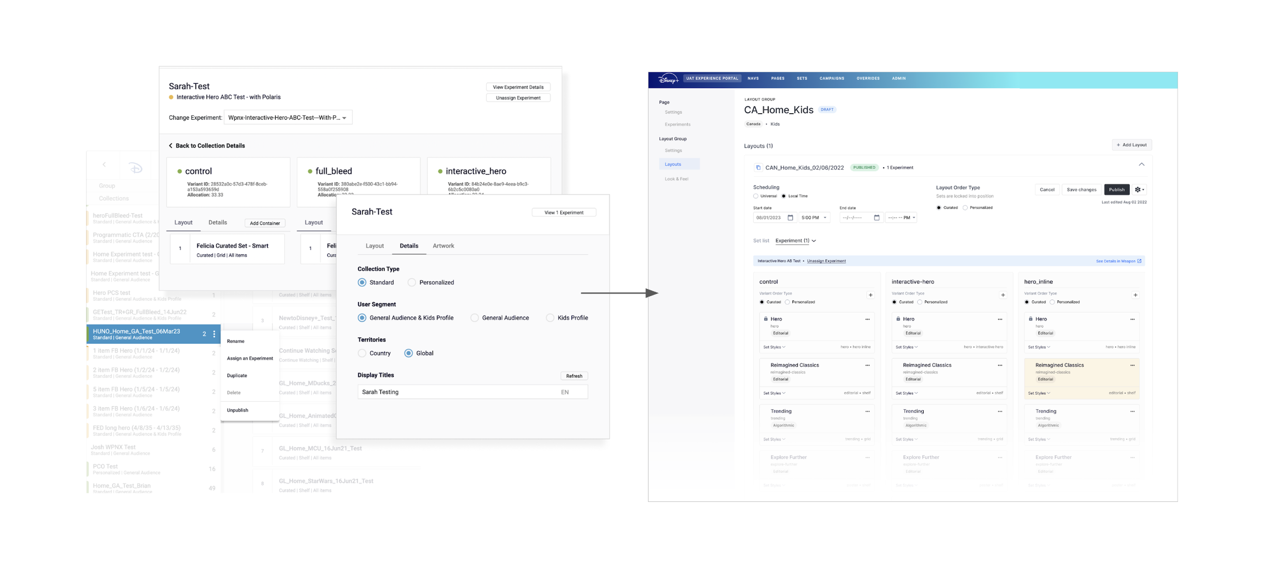
Direction 02 – Integrated:
Integrating the experiment feature within the Layout feature without leaving the page.
Cons
Storing lots of data within one workspace slows down performance
Doesn’t necessarily fit into future roadmap
Pros
Offers easy access and visibility into live content for comparison
Preserves context
Less clicks
Unified workspace


Style selection iterations
Selecting content styles (ie full bleed, hero, etc.) is a key feature of managing A/B tests. ‘Experiment Cards’ offer this functionality. I worked through a few iterations:
Version 01:
Expand / Collapse ‘See Styles’ & ‘Hide Styles’
When collapsed, style selections are hidden
Style type dropdowns are stacked

Version 02:
Expand / Collapse ‘Set Styles’
When collapsed, style selections are visible
Style type dropdowns arranged in a 2-up, saving vertical space

Final approach:
Ultimately, I decided to proceed with Version 02 given the benefits of visibility without needing to expand & preservation of vertical space
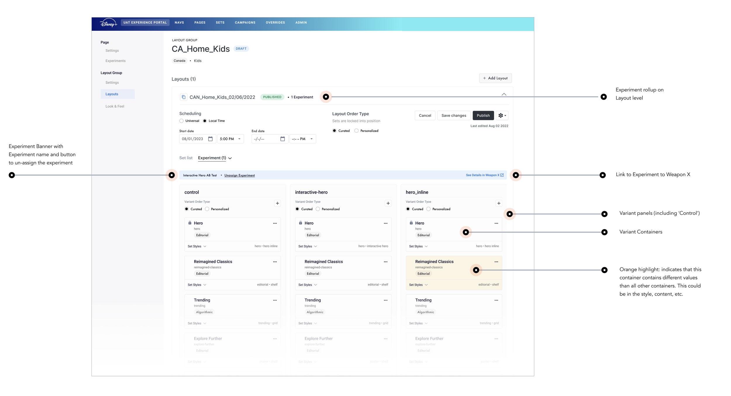
Anatomy & Handoff
This option offers users the ability to quickly access rooms without having to scroll and find the milestone card.